Design System & Accessibility
Building a culture behind the design system from adoption to reviews and improvement.

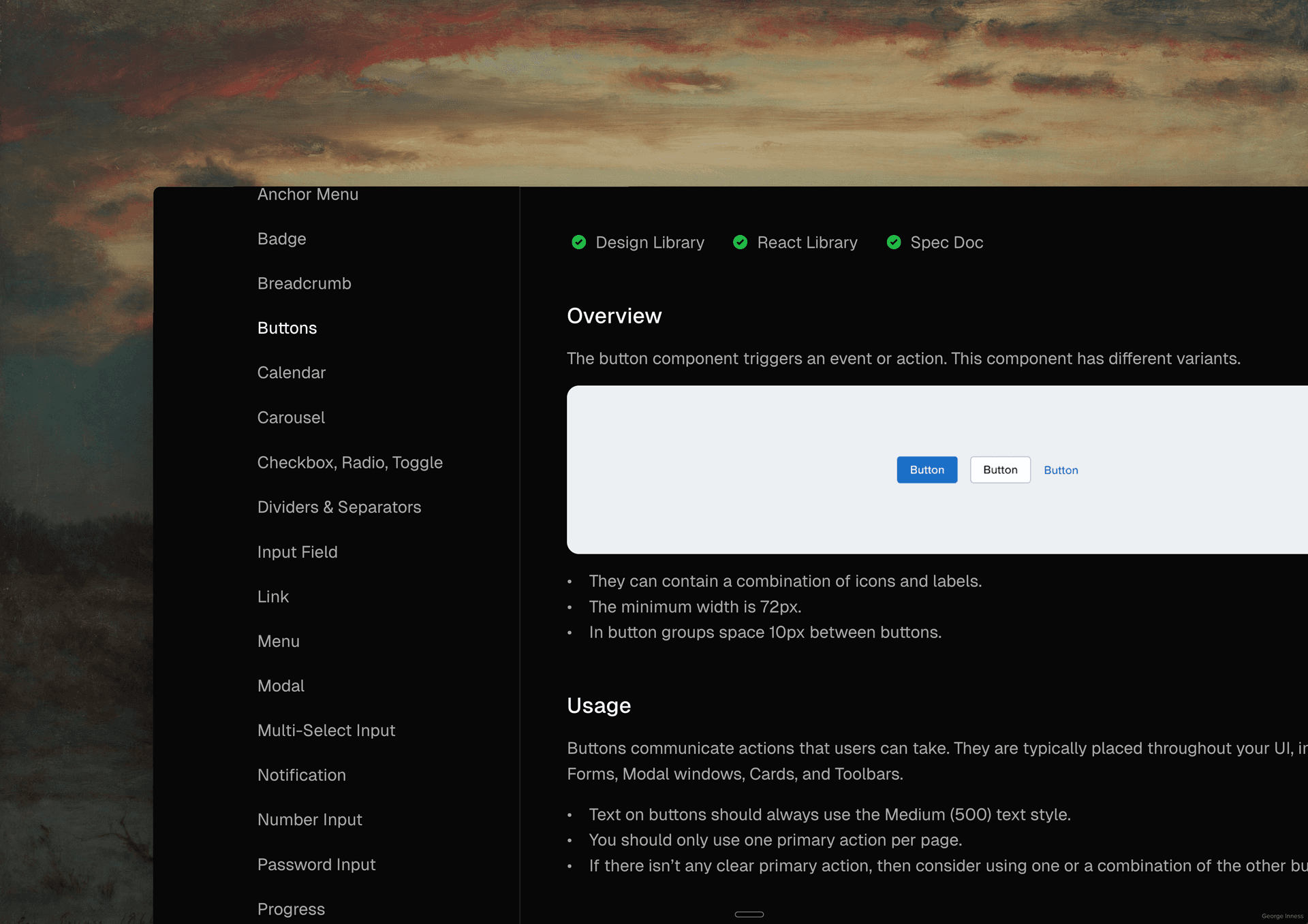
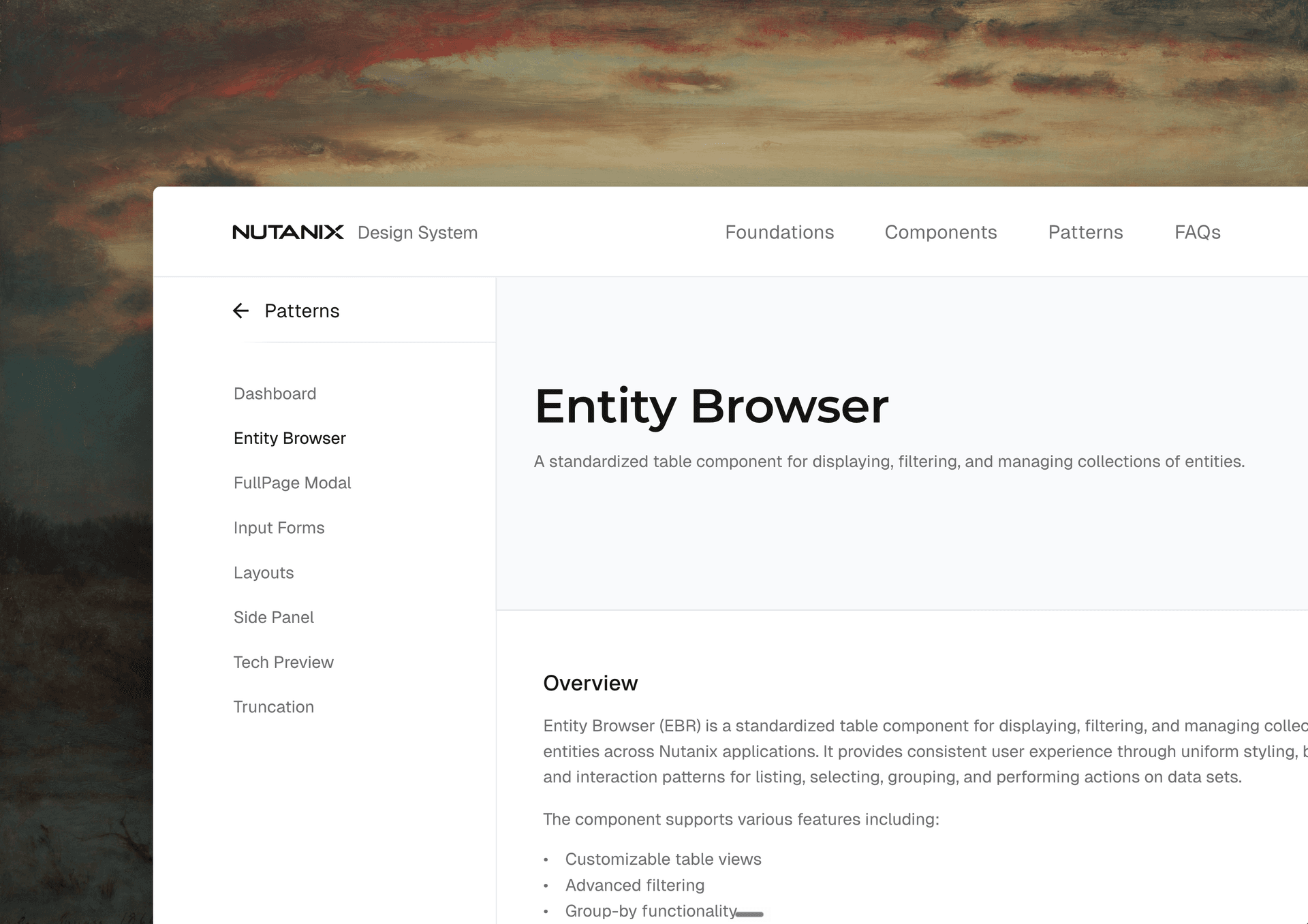
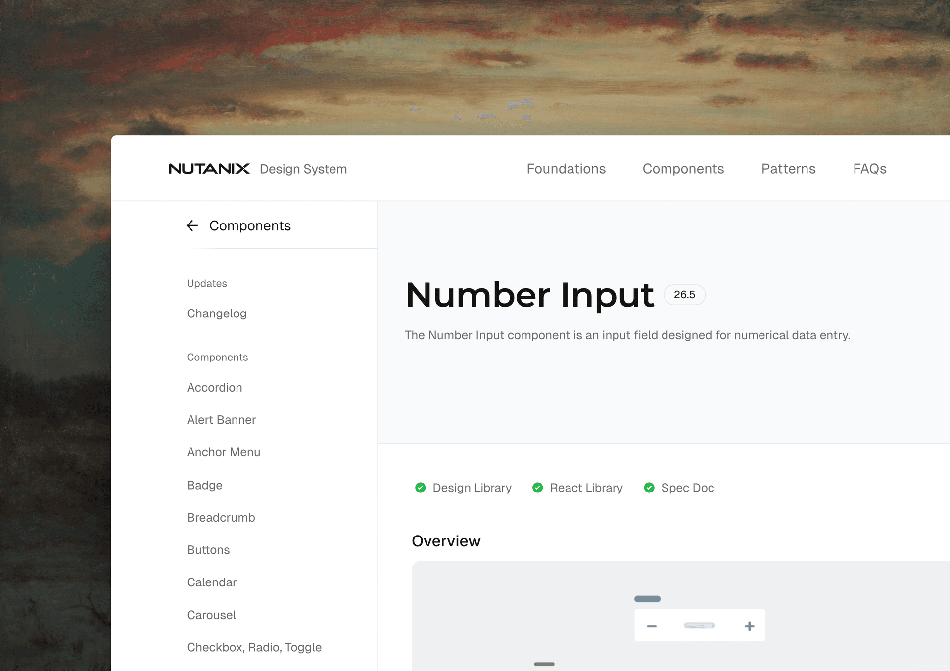
I led the design system at Nutanix, where adoption and building a culture where processes, tools and continuous improvements wired into every release cycle were the goal.
By 2018 the design team had outgrown its own guidelines, so we shipped a visual refresh, more than 100 components, and a library organized by purpose: what each element does, not what it looks like.
Those components grew out of Prism, the HTML5 console I helped design years earlier. That twelve-year arc is its own story, told in the Nutanix User Interface case study.
The problem was getting 70+ designers and engineering teams across three countries to actually use them. So the work shifted from publishing guidelines to building adoption infrastructure.
More than a component library
At its best, a design system does not just ship parts. It defines how teams should work — which tools to use, how patterns combine, and what “done” looks like before code merges. DS 2.0 gave Nutanix the visual language and 100+ components. What I owned next was the operating model that made those patterns stick.
The problem
Three pressures had already forced DS 2.0: accessibility feedback on text readability, acquired products that couldn't migrate to Nutanix's patterns, and a visual language (pastel colors, rounded type) that looked dated next to modern enterprise UI. We'd solved the component and direction problems. What remained was enforcement. Without it, the library stayed optional.
Designers and engineers kept recreating one-off patterns. Accessibility varied by team. Complex edge cases, verbose VM names, long alert messages, dense datacenter tables, went unhandled because there was no shared baseline or way to measure progress. We needed a system teams would actually use. A PDF of guidelines wasn't going to cut it.
My role
I led the design system, then managed the team behind it. We'd already built the component architecture and the Prism visual language (covered in the Nutanix User Interface case study), so what came next was mine to own: adoption strategy, evaluating centralized tooling, running the workshop program, biweekly feedback loops with product designers, the accessibility initiative and the React component library.
I went from a single IC to managing six designers and four engineers.
Process & decision rationale
Rather than rebuild components from scratch, we built a data-driven adoption loop on top of DS 2.0.
Purpose before pattern. The taxonomy grouped every component by job: layout, display data, input data, or take action. Tables, charts, and badges look nothing alike, but they share a purpose, and that grouping forced designers to choose by intent instead of habit. We extended it into documentation, Figma libraries, and the React catalog, so the logic was searchable instead of living in someone's head.
Design for enterprise edge cases. Nutanix UI is data-dense by nature. Components had to survive unreasonable character counts, infinite-scroll tables, and sort, group, and action patterns without losing hierarchy. Nothing became a standard until it survived a real product scenario pulled from Prism, not a demo string.
Audit consumption first. We mapped which teams used the library, where patterns broke down, and which AOS releases correlated with adoption gains. Mandating compliance didn't work. Showing teams their own drift did.
Validate through collaboration. Biweekly check-ins with product designers surfaced needs we'd missed. Workshops and self-serve resources let teams migrate without blocking releases. A component only became a standard after it passed real design review, never committee approval.
Centralize and measure. We adopted shared design tooling with procurement and engineering so the library lived where design and engineering already worked, then tracked adoption per AOS release until we hit 100%.
Continuous improvement over big bangs. We treated adoption as a series of small, release-by-release corrections — audits, workshops, tooling tweaks — not a one-time rollout. You are only as effective as the systems you build around the work.
Look outside for answers. Nutanix had no internal playbook for design-system compliance at our scale, so we borrowed proven concepts from manufacturing quality loops, editorial style guides, and software linting — then adapted them for design libraries and pull-request review.
Automate feedback loops. Custom scripts analyzed design and code repositories during pull requests, surfacing library drift and accessibility gaps while teams were already in context. That turned mentorship into just-in-time awareness in the workflow, not another standing meeting.
| Product Release | AOS Date | Library Adoption |
|---|---|---|
| 5.18 | 08/2020 | 43% |
| 5.2 | 05/2021 | 50% |
| 6.0 | 06/2021 | 100% |
On the engineering side, we paired the design library with an accessibility-ready React component library, turning interactions once prototyped in CodePen during DS 2.0 into WCAG-documented production patterns teams could ship without reimplementing behavior.
Outcomes & evidence
Adoption climbed from 43% to 100% across four major release cycles. The system lives at the Nutanix Design System site. The patterns it standardizes started on Prism. That twelve-year foundation is its own case study.
Adoption kept climbing after 6.0, from 66% at release 6.1 to 100% by 6.6.
Accessibility became a core standard. We partnered with Level Access for audits and built a11y guidance into every component's documentation, closing the readability gap that triggered DS 2.0 in the first place and taking the design team from no accessibility background to WCAG-compliant patterns in production.
Reflection
DS 2.0 proved we could craft components and a coherent visual direction for a hyperconverged product.
The harder problem was everything after: change management at scale. Driving adoption across designers and engineering teams meant translating the system into terms each function understood, testing components against real edge cases instead of ideal ones, and proving progress with numbers people actually trusted.
The Infrastructure UI case study covers the product context. This one covers what it took to make those patterns stick. Building the library was a project. Keeping it alive is an ongoing practice, with yearly interviews and UX scoring still part of the work.
Evaluate effectiveness over time. The business is your consumer. Product, engineering, and design leadership reassessed the system every release cycle, pulling adoption metrics, workshop feedback, and UX maturity scores. That evidence set the roadmap for what came next.
Gallery
Impact
Scaled design library adoption from 43% across four major AOS release cycles (2020 to 2023)
Scaled design library adoption from 43% to 100% across four major AOS release cycles (2020 to 2023)Over institutionalized purpose-based components.
Over 100+ institutionalized purpose-based components.Grew the design system team designers and 4 engineers; shipped an accessibility-ready React component library
Grew the design system team to 6 designers and 4 engineers; shipped an accessibility-ready React component libraryPartnered with Level Access to bring WCAG-compliant patterns into production, from poor text-readability feedback to documented a11y standards per component
Partnered with Level Access to bring WCAG-compliant patterns into production, from poor text-readability feedback to documented a11y standards per componentCodified the visual language first established on Prism Element and Prism Central into standards at https://ds.nutanix.design
Codified the visual language first established on Prism Element and Prism Central into standards at https://ds.nutanix.design
Credits
Design Lead / Manager
John Torres
Team
Client
Nutanix