Design System & Accessibility
Design System & Accessibility
Design System & Accessibility

0:000:00
When I first took on the role as a design system lead in 2008, the design system was a set of guidelines and rules that was available as a resource but with no enforcement plan in sight. This led to inconsistent implementation, and as the team kept growing it was clear that the lack of a unified system was causing inefficiencies and confusion, hindering our ability to deliver cohesive and high-quality designs.
To address these challenges, I initiated a comprehensive audit of the system's consumption. This step was crucial in identifying the pain points and areas that needed immediate attention.
Product Release AOS | Date | Library Adoption |
|---|---|---|
5.18 | 08/2020 | 43% |
5.2 | 05/2021 | 50% |
6.0 | 06/2021 | 63% |
By capturing data on how the design system was being used, we were able to establish clear metrics for improvement, setting the stage for a structured approach to transformation. On the engineering side, discussion to standardize and migrate applications as part of new features allowed the company to slowly transition to our libraries.
Strategic Improvements: Centralization and Adoption
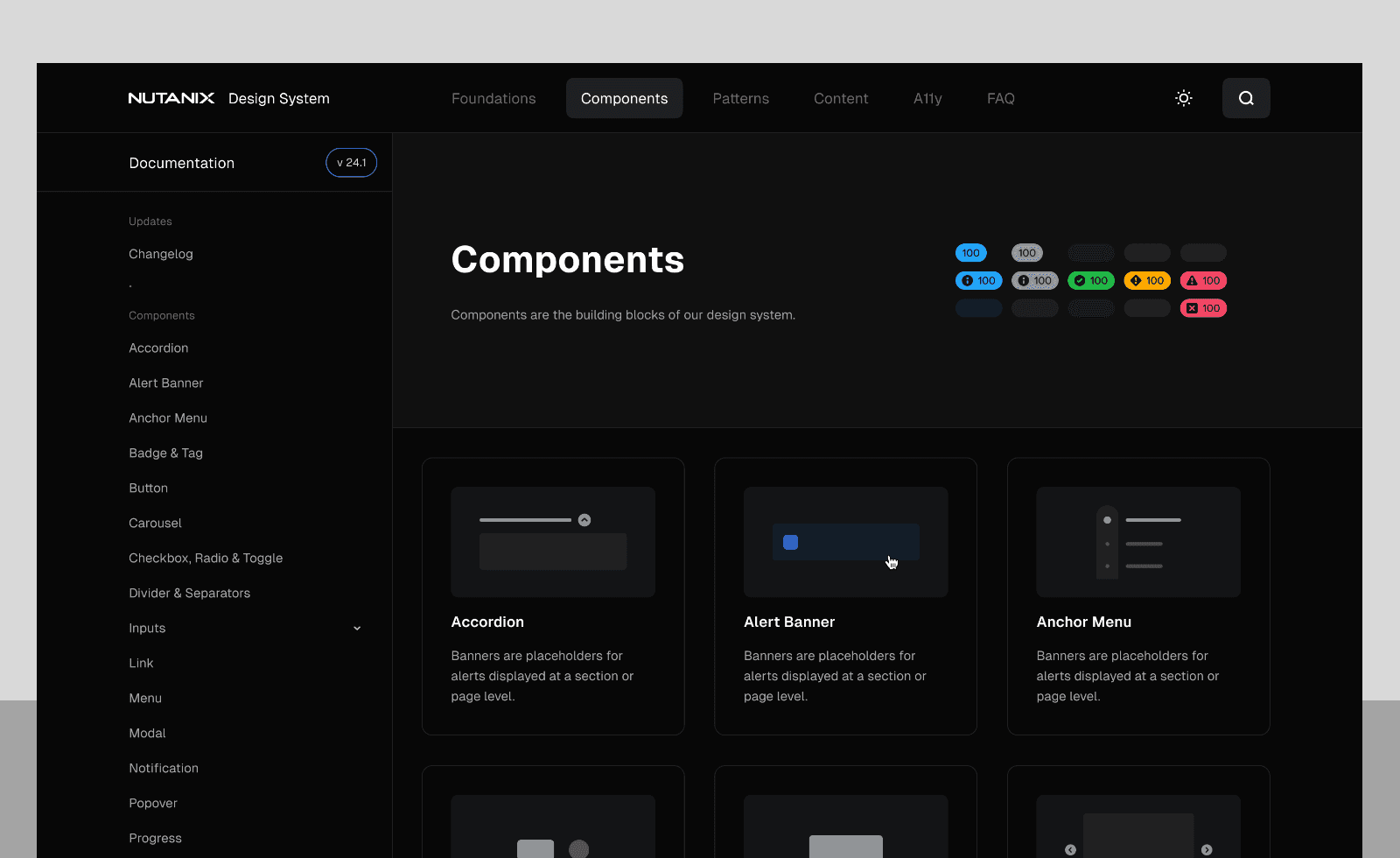
Current Nutanix Design System Website. https://ds.nutanix.design
One of the most significant changes implemented was the evaluation and adoption of a centralized tooling system. This decision came with its own set of challenges. Convincing the procurement team and executive leadership to invest in new tools required strategic communication and a clear demonstration of the potential benefits. Internally, I faced the task of convincing designers to transition to tools they were unfamiliar with.
To ensure a seamless transition to our new design tools, my team and I created a comprehensive series of workshops and online learning resources. These materials were carefully crafted to simplify the learning process and equip our designers with the skills they needed to maximize the potential of these tools.
Efforts increased adoption to 100% rate among our design team in two releases time-span. This was a significant milestone, enabling us to redirect our focus from tracking adoption to driving continuous improvement and refinement of our systems.
Product Release AOS | Release Date | Library Adoption |
|---|---|---|
6.1 | 02/2022 | 66% |
6.5 | 07/2022 | 87% |
6.6 onward | 01/2023 | 100% |
Current Scope and Direction
Fast forward a couple of years, and our team has grown to include 6 full-time designers and 4 full-time engineers dedicated to taking our design system to the next level. Right now, we're laser-focused on upgrading our React components to the latest version, ensuring they meet the highest security standards and pass rigorous testing. This effort is a key part of our strategic plan to bring our design system up to speed with industry best practices, without disrupting our entire system.
We're committed to delivering a world-class design experience that meets the evolving needs of our users. Through open communication channels with both designers and engineers, we continuously gather feedback, identify areas for improvement, and refine our design system to ensure it remains responsive to user needs.
To measure our progress, we conduct yearly interviews to assess the design system's state and identify opportunities for growth. Our UX/UM score helps us track changes over time and quantify the impact of our roadmap on both engineering and design teams. This data-driven approach enables us to make informed decisions and drive meaningful enhancements to our design system.

Accessibility as a Core Standard
Alongside the technical evolution of the design system, accessibility became one of the most impactful areas I championed — and one of the most challenging to execute at scale.
The initiative started as a strategic commitment: make Prism Central and the broader component library fully WCAG-compliant by 2025. We partnered with Level Access, a third-party accessibility auditing firm, to establish a baseline and prioritize improvements. What followed was an intensive multi-quarter effort across design and engineering that fundamentally changed how our team approached component work.
Building an a11y-ready React library
One of the most enduring contributions was building accessibility into our design documentation itself. We added dedicated accessibility sections to every component's documentation page — covering guidelines, do's and don'ts, and UX pattern rationale — so that accessibility was no longer an afterthought but a first-class consideration for any designer or engineer consuming the system. We also introduced an internal Library Design Brief to inform both the US and Bangalore teams of a11y updates as they shipped.
Bringing the team from zero to capable.
When we kicked off the accessibility drive, the design team had no prior background in a11y. I led efforts to onboard the team through structured courses, working sessions, and a dedicated Slack channel for ongoing questions. One of the retrospective highlights from the team: "The team started from 0 a11y knowledge and managed to do a great job so far." The a11y-compliant theme we shipped was described as coming together fast and looking great — a testament to how quickly the team leveled up.
Leadership Learnings: Growth and Development
Transforming our design system has been a game-changer for me, offering a wealth of valuable lessons. To drive such a massive overhaul, I had to develop a deep understanding of what makes teams tick, how to manage complex projects, and how to communicate effectively with stakeholders.
One of the most critical aspects of this journey was change management. It wasn't just about having the technical know-how; I also had to be able to clearly articulate the vision and benefits of the new system to stakeholders at every level. This ability to communicate the "why" behind the change was key to securing buy-in from both our executive team and designers.
Through this experience, I've gained a unique combination of skills, including the ability to grow and develop high-performing teams, create effective training programs, and manage cross-functional projects. I'm confident that these skills will serve me well in driving future success.
The Road Ahead
Cell Text
Cell Text
Cell Text
Cell Text
As we look to the future, our focus remains on continuous improvement and modernization. Our goal is to transition to more modern standards while maintaining the core principles that have guided the system's development. This includes a commitment to consistency, efficiency, and collaboration.
We're exploring new technologies and methodologies that can enhance the design system's capabilities, like the integration of our documentation to our Slack chat bot for questions regarding standards. The next phase of accessibility work involves expanding coverage to visualization components, scaling design-side ownership across more designers, and ensuring that future contributors to the design system have the a11y knowledge to maintain the standards we've built.
When I first took on the role as a design system lead in 2008, the design system was a set of guidelines and rules that was available as a resource but with no enforcement plan in sight. This led to inconsistent implementation, and as the team kept growing it was clear that the lack of a unified system was causing inefficiencies and confusion, hindering our ability to deliver cohesive and high-quality designs.
To address these challenges, I initiated a comprehensive audit of the system's consumption. This step was crucial in identifying the pain points and areas that needed immediate attention.
Product Release AOS | Date | Library Adoption |
|---|---|---|
5.18 | 08/2020 | 43% |
5.2 | 05/2021 | 50% |
6.0 | 06/2021 | 63% |
By capturing data on how the design system was being used, we were able to establish clear metrics for improvement, setting the stage for a structured approach to transformation. On the engineering side, discussion to standardize and migrate applications as part of new features allowed the company to slowly transition to our libraries.
Strategic Improvements: Centralization and Adoption
Current Nutanix Design System Website. https://ds.nutanix.design
One of the most significant changes implemented was the evaluation and adoption of a centralized tooling system. This decision came with its own set of challenges. Convincing the procurement team and executive leadership to invest in new tools required strategic communication and a clear demonstration of the potential benefits. Internally, I faced the task of convincing designers to transition to tools they were unfamiliar with.
To ensure a seamless transition to our new design tools, my team and I created a comprehensive series of workshops and online learning resources. These materials were carefully crafted to simplify the learning process and equip our designers with the skills they needed to maximize the potential of these tools.
Efforts increased adoption to 100% rate among our design team in two releases time-span. This was a significant milestone, enabling us to redirect our focus from tracking adoption to driving continuous improvement and refinement of our systems.
Product Release AOS | Release Date | Library Adoption |
|---|---|---|
6.1 | 02/2022 | 66% |
6.5 | 07/2022 | 87% |
6.6 onward | 01/2023 | 100% |
Current Scope and Direction
Fast forward a couple of years, and our team has grown to include 6 full-time designers and 4 full-time engineers dedicated to taking our design system to the next level. Right now, we're laser-focused on upgrading our React components to the latest version, ensuring they meet the highest security standards and pass rigorous testing. This effort is a key part of our strategic plan to bring our design system up to speed with industry best practices, without disrupting our entire system.
We're committed to delivering a world-class design experience that meets the evolving needs of our users. Through open communication channels with both designers and engineers, we continuously gather feedback, identify areas for improvement, and refine our design system to ensure it remains responsive to user needs.
To measure our progress, we conduct yearly interviews to assess the design system's state and identify opportunities for growth. Our UX/UM score helps us track changes over time and quantify the impact of our roadmap on both engineering and design teams. This data-driven approach enables us to make informed decisions and drive meaningful enhancements to our design system.
Accessibility as a Core Standard
Alongside the technical evolution of the design system, accessibility became one of the most impactful areas I championed — and one of the most challenging to execute at scale.
The initiative started as a strategic commitment: make Prism Central and the broader component library fully WCAG-compliant by 2025. We partnered with Level Access, a third-party accessibility auditing firm, to establish a baseline and prioritize improvements. What followed was an intensive multi-quarter effort across design and engineering that fundamentally changed how our team approached component work.
Building an a11y-ready React library
One of the most enduring contributions was building accessibility into our design documentation itself. We added dedicated accessibility sections to every component's documentation page — covering guidelines, do's and don'ts, and UX pattern rationale — so that accessibility was no longer an afterthought but a first-class consideration for any designer or engineer consuming the system. We also introduced an internal Library Design Brief to inform both the US and Bangalore teams of a11y updates as they shipped.
Bringing the team from zero to capable.
When we kicked off the accessibility drive, the design team had no prior background in a11y. I led efforts to onboard the team through structured courses, working sessions, and a dedicated Slack channel for ongoing questions. One of the retrospective highlights from the team: "The team started from 0 a11y knowledge and managed to do a great job so far." The a11y-compliant theme we shipped was described as coming together fast and looking great — a testament to how quickly the team leveled up.
Leadership Learnings: Growth and Development
Transforming our design system has been a game-changer for me, offering a wealth of valuable lessons. To drive such a massive overhaul, I had to develop a deep understanding of what makes teams tick, how to manage complex projects, and how to communicate effectively with stakeholders.
One of the most critical aspects of this journey was change management. It wasn't just about having the technical know-how; I also had to be able to clearly articulate the vision and benefits of the new system to stakeholders at every level. This ability to communicate the "why" behind the change was key to securing buy-in from both our executive team and designers.
Through this experience, I've gained a unique combination of skills, including the ability to grow and develop high-performing teams, create effective training programs, and manage cross-functional projects. I'm confident that these skills will serve me well in driving future success.
The Road Ahead
Cell Text
Cell Text
Cell Text
Cell Text
As we look to the future, our focus remains on continuous improvement and modernization. Our goal is to transition to more modern standards while maintaining the core principles that have guided the system's development. This includes a commitment to consistency, efficiency, and collaboration.
We're exploring new technologies and methodologies that can enhance the design system's capabilities, like the integration of our documentation to our Slack chat bot for questions regarding standards. The next phase of accessibility work involves expanding coverage to visualization components, scaling design-side ownership across more designers, and ensuring that future contributors to the design system have the a11y knowledge to maintain the standards we've built.

